Attention to design details implies that the same care and attention has been spent on the other (less visible) parts of the product.
Creating a Graphical User Interface is always a challenge, because people have different sense of aesthetic. There are however few guidelines that if you stick to, there is a good chance you are successful. This article is gist of the following books modulo my experience:
- Visual Design for the Modern Web Penny McIntire
- The Design of Sites: Patterns for Creating Winning Web Sites, Second Edition Douglas K. van Duyne; James A. Landay; Jason I. Hong
- Easy Web Design Mary Millhollon; Jeff Castrina; Leslie Lothamer
Some of the techniques described in those books are outdated, because the web design accelerated from the time they were written, but there are things that are still valid.
Visual Harmony
This is one of the most important rules in my opinion. Visual harmony defines whether or not a page looks good. An effective design is a balance between serenity and stimulation. The page needs to be serene enough just to convince the user it’s easy to use, but in other hand it also needs to be stimulating enough so end user wants to use it. If page is too serene then it might become boring, too much of stimulation and the page might become visually chaotic. To illustrate this rule, let’s stick to the architecture for a moment. Which one of the following has more to do with harmony?
 I think you’ve already knoaw the answer, it’s quite intuitive. The right balance between serenity and stimulation is the key to reach visual harmony.
Techniques for providing Visual Harmony
- Repeat Elements - In general, repetition of colors, layouts, blocks of elements, the same graphics, fonts, kinds of buttons etc. provide visual consistency. Repetition of elements is like a rhythm in music.
- Manipulate Contrast - You can use contrast either to divide page into logical sections or highlight important elements on the page. It’s the very basic instrument to provide visual harmony.
- Chunk Related Information - Organize related elements on page into chunks, this also helps to make the overall impression that page is simple. One of the options would be to take boostrap that contains components that you can reuse.
- Align Elements - Align as much as possible. The more you align, the more consistent page looks.

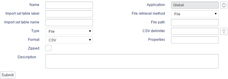
Clear forms
Some important things to keep in mind:
- Put the focus on the first element on the form.
- When describing the field forms, use familiar language so users do not have to figure out what it is about.
- Required fields must be marked on the form.
- If some field has special format, prefill the input with example text, or force the input to be exactly what you need.
- Reduce the amount of typing required, use suggestion drop down lists - simply do not ask users for the information you’ve already might have.
- Intelligent error handling - don’t wait till user submit the form to show the error, in case you already know that something is not correct.
- Make all functionality available from a keyboard.
In general, forms needs to be simple, clear, visually well-aligned, and what’s most important intuitive.
Progress on the page
Not so long time ago, when almost all actions on the page were displayed as the result of its reload, the fact of progressing was indicated by the browser. It was good enough for users to sit tight and wait for the result. Nowadays, the technology allows for the page to load content through ajax/websocket and the progress of the operation is not so obvilus. Without progress indicator end users might be frustrated waiting for result, and wondering if the operation was already started or not.
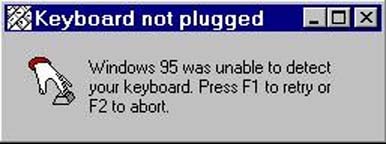
Error messages
Good error messages can contribute to building good page reputation.

Good error messages should consist of the following information:
- What happened
- Why it happened
- What should user do in order to correct the problem
Colors
Choose one or two main colors and use scheme generators to figure out rest of colors for you page:
Stimulation
- Audio effects - this is not a visible trend in the web, but I think adding a subtle sounds for specific actions on the page might become a trick that makes the difference.
- Paralaxing - http://www.alquimiawrg.com - open and move mouse over the page
- Scrolling effects - http://www.sony.com/be-moved - open it and just scroll
- Fancy input texts etc - http://tympanus.net/Development/TextInputEffects
- Fancy buttons etc - http://tympanus.net/Development/ButtonStylesInspiration
- and probably many many more…. the human imagination is endless.
Here are some website examples, nontrivial and creative in terms of stimulation:
- The DNA project: http://jviewz.com
- FUTURESTATES - http://futurestates.tv
Summing up
Designing web page is a challenging task. There are few rules that you can stick but that does not guarantee a success in 100%. If it comes to me, I’m following three rules:
- visual harmony
- consistency
- intuition :)
Bonus: if you are looking for inspirations, take a look at codrops
